

If you’ve some idea about UX design, you know it has a direct impact on user experience.
If you have an intuitive, seamless, and user-friendly design, your audience is bound to be more engaged and you will have more conversions. On the other hand, a bad design will cause nothing else but confusion and dissatisfaction among users.
Here we will see what makes UX design good or bad with some practical examples. By the time you’re done reading this article, you’ll have a clear idea about the best UX design approach for your digital solution.
Good vs Bad UX Design
1. Usability
One of the primary tasks of UX design is to enhance the usability of any product. If the design gets in the way of functions instead of helping you get there, it is a case of a bad UX design.
Good example:
Miro is a design platform with a focus on collaboration features meant to help teams. They have a lot of features available to the users that can seem overwhelming to an average user.
However, they have an onboarding feature that increases the functionality of the platform and helps users with their designs.

During the set up process, Miro will ask about your experience with visual tools. This helps them determine how familiar you are with such tools and how they can help guide you through the process.

As you start your work, you will see various popups that help you understand what you should be doing in a non-intrusive, helpful way. Their popups will come up based on your goals and experience level.

This lets you understand the tool setup of the platform without overwhelming you with all of its offerings,which helps increase its usability to even new users.
This makes it a great tool that you can easily get used to and makes you come back to them for future projects.
Bad example:
One of the most infamous examples of bad UX designs is the Juicero Juicer. The name tells you that it is a juicing machine. You put the fruit in the thing, press the button, and the device churns out the juice. Simple, right?
If it were that simple, it would not be here on this list in the first place. So, what’s the issue?

First of all, you need to connect this device to your WiFi. Then, you have to install the official app on your Android or iOS mobile device. After that, you can put in your ingredient of choice in the machine and use the app to run it.
You may be thinking, “What if I do not have an Android or iOS device?” Well, you are out of luck, your juicing machine is unusable because you do not match the phone requirements.
Reading through the steps will give you an idea of how ridiculous the requirements are for such a simple device. They have only added unnecessary steps to the process, harming the usability of the product. If you ever decide to launch a juicing machine, do NOT follow this example.
2. User control
When designing UX, it is important that users get to have the most control over their actions. Sometimes, some difficulties might happen when using products, but the UX design should be such that they never feel “lost” in any situation.
One of the principles behind user control is to make sure users don’t feel sad, worried, or guilty. This means we should give users the option to back out of unwanted situations.
Good example:
We have all sent someone the wrong thing on multiple occasions. For friends and family, it can be a funny story to share and joke around with. However, sometimes sending someone the wrong thing can have unfavorable consequences.
These consequences can include awkward situations to sending someone confidential information they should not see.
Thankfully, Gmail thought of that and provided an undo button for a few moments after sending an email to help users correct their mistakes.

The prompt for undo is shown alongside the “message sent” confirmation prompt, to let the user know the option is there. This can give the sender a moment to realize if what they sent was the right thing.
Even if they have a little doubt, they can click undo, check the mail, and resend it. No harm no foul. The option can be a lifesaver for a lot of people, especially for people who need to interact with higher-ups on a daily basis.
Bad example:
Apple is one of the most successful companies in modern times, with its products and services being praised by critics and fans alike. So why am I mentioning Apple in this segment about bad examples?
If you are an iPhone user and you take a lot of pictures, you are very likely a victim of the situation I am about to mention. Whenever you run out of space on your phone, and you take a picture, you will see the following message popup on your screen.

You are sad you cannot take a photo right away, especially if it is a time-sensitive moment. Anyway, you get the idea of what’s going on, and what you need to do. But what are the options presented to you?
If you press Done, nothing happens. You just go back like nothing ever happened. And the other option is settings. They do not indicate if they will even take you to the right option where your problem might get resolved.
Unless you already do not know what to do, you will have to go through trial and error to figure out your next move. The popup should guide you to an actual solution instead of leaving you out in the dark.
For a company as large and successful as Apple, they should provide a better solution to enhance user control.
3. Findability
Findability (or discoverability) is the factor of users being able to find what they need easily after they encounter any interface. It could be a feature, a piece of content, or any product on your site that they know is available.
When designing your UX, it is important for users to understand which elements they can interact with. Interacted portions that can “miss” the eye of the user are a common thing and have been given the name “Mystery Meat Navigation” (coined by Vincent Flanders of Web pages that suck in 1998).
The term “Mystery meat” is a reference to the meat served in American public school cafeterias where it was so processed, that no one could tell its origin by observing it.
Good example:
Wayfair is a site where you can get all kinds of furniture or home appliances. In order to optimize the findability of their products, they have a super fast and optimized search bar that tries to predict what you may need at the typing of one letter.
This not only allows visitors to not have to type out what they are looking for, it also works as an advertisement for their other products, letting visitors know what they offer.

Now, let’s say, you did type out the whole word of what you need, but you made a typo. Knowing how common typos are, Wayfair made it such that they would show what you were probably looking for even if you made a mistake.

In this example, I wrote screeb by mistake, but the search bar correctly understands that I made a silly typo and showed what I really wanted instead.
This feature enhances the user experience greatly, making browsing through their website a breeze, and allowing visitors to easily find what they are looking for.
Bad example:
IMDb is a website dedicated to movies and TV shows, known for their top 250 rankings. If you are an avid movie enjoyer, you have probably heard of the site.
However, if you never heard of it and decided to visit it after hearing about it from here, be prepared to be greeted by an extremely cluttered interface.

At first glance, other than the movie poster and trailer in the center, you will be overwhelmed by everything around it. There are no whitespaces utilized, and no structure that tells you what you should be looking at.
Despite being so overwhelming with its presentation, there are no shortcuts that can take you anywhere specific, and all you can do is keep scrolling a very long page to find anything that catches your eye.
This is a huge detriment to the site’s findability, making you go through unnecessary steps to get what you are looking for.
4. Desirability
Desirability is the factor of a UX design that makes it preferable to an audience among many others despite being functionally the same. This is one of the more difficult things to pin down on what exactly works here.
It is more dependent on the subjective taste of the user than how well a designer has built his UX. The desirability of a product is the element you try to implement after you have determined the functionality, usability, and other basic elements of UX. This depends on many factors like aesthetics, brand value, audience choice, etc.
It is difficult to show a “good” or “bad” example of it, but I have provided a situation and another interesting case to make you understand desirability.
One of the easiest examples of understanding desirability would be the choice between a Toyota and a Lamborghini car.

If given the choice between these two cars to anyone, everyone would pick the Lamborghini (even you!). On a functional level, both these cars do the same things.
You can drive both of them, they take you from point A to point B, and none of them have any severe flaw in their main objective.
But everyone would pick the Lambo right away because of its desirability. It is the sleek design, the brand name, the social status, and many other factors that make it the obvious choice.
All of these are external factors that determine the desirability for not just these two cars but for any other product.
An interesting example of UX design would be RTS games which have very high desirability among PC gamers. RTS games are known to be one of the most complicated genres of video games, commonly with somewhat unintuitive and complicated UI and overall systems.
Yet they have a large fanbase who prefer these games over a lot of the modern and simpler video games provided by consoles. Some companies like Nintendo even delved into the strategy genre to create similar games for consoles with great success with Fire Emblem and Pikmin.
But nothing comes close to what a true PC RTS game brings onto the screen. I mean, look at the following screenshots.

Game: Starcraft 2

Game: Crusader Kings 2
If you do not already play these games, you will have difficulty understanding what is going on in these screenshots and why they are as popular among the PC gaming community.
On further inspection as an expert, they may be either good or bad designs, but for an average person, they can seem incomprehensible on first viewing.
This could be a result of years of experience of these players with these types of games, so anything simple does not scratch their itch when it comes to other genres. To understand the desirability of your product, the best way to determine would be to do user testing.
That way, you can design your UX based on your audience and what they like.
5. Consistency
Over the years of UX designing, some aspects have maintained consistency of certain aspects, making them standard practices. Breaking away from such a consistent design pattern without good reason can confuse the audience and bring friction to your product.
Note: Friction is the unnecessary actions in an interface that only slow down a user.
Good example:
52WeekofUX is a website that is about a discourse on the process of designing. It presents itself in a unique manner, but shows off its consistent design themes throughout its pages.


First of all, you will notice the black-and-white color scheme it has maintained throughout the webpage as you scroll by. Even the images it uses do not use color, instead, they use pencil sketches that match the aesthetics they are trying to present.
True to their name, they have segmented their pages based on “52 weeks” where each “week” provides various insights and discussions regarding design philosophies. Not only is it an excellent website for understanding consistent UX design, but you can also learn about different aspects of it through insights provided by the site owner.
Bad example:

I don’t think I need to explain to you why this website is an example of bad UX design. The Yale School of Art decided to be bold with their website design choice at the cost of UX consistency.
There is nothing wrong with breaking commonly accepted design conventions, but that should be done with a purpose in mind. If the purpose of this website were to show off what inconsistency does for a homepage, then they have accomplished their goals.
But it is something that should not be followed by anyone who wants their visitors to actually use their website or digital product.
6. Device compatibility
In this age of different types of designs competing against each other, make sure your website or digital product’s UX is compatible with the device they are made for; most notably for websites and mobile phones since they constitute 58.3% of site visits.

Graph by Mobiloud
Remember, a design that looks good on a big screen will not translate well on a smaller screen if no changes are made. So. to ensure optimum responsiveness, you will need to make adjustments for different versions.
Good example:
Etsy is a global marketplace where people come to buy and sell handmade, custom, vintage, and unique gift items. As a website specializing in arts and crafts, they have a stellar website with great UX design.

You get straight to the categories available that are presented in a nice way for a monitor screen. But this interface would look very cluttered on a smaller screen. How did they design their mobile website?
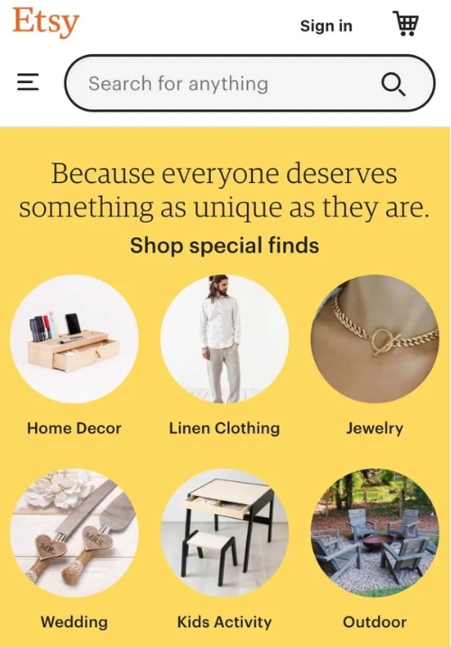
As we can see, they simplified it further and made the category icons clearly understandable on mobile. The text is removed in favor of category presentation and an icon on the top left of the screen is present to open up all the other categories.
Bad example:
Madewell is a clothing brand with a great website for desktop screens. It showcases everything a user will want to know at a glance.

However, when we look at its mobile version, very little is adjusted for it.

Just as we enter the site, we are greeted with this cluttered mess with popups from three different sides of the screen. Presentation aside, navigating through it does not feel very smooth either. It feels like using an inferior version of the desktop website.
Wrapping it up
We hope these good vs bad UX design examples will inspire you to make the most of your website or app. UX/UI design is a crucial and difficult task, so it is important we learn the optimal ways by observing practical examples like this.
If you are unsure about designing UX yourself, don’t hesitate to contact us so we can help guide you in building the best website or digital products you might need. Our team of experts has experience in various fields with many accolades under our belt. We hope that you contact us to help you in your path to success.
